Workday Icon Library 2024

Architected and executed a comprehensive library of 600+ custom icons to serve as the functional visual language for the new Workday brand identity.
Operated as both the strategic design lead and a hands-on creator, directly illustrating key assets while managing a dedicated team of designers to scale production.
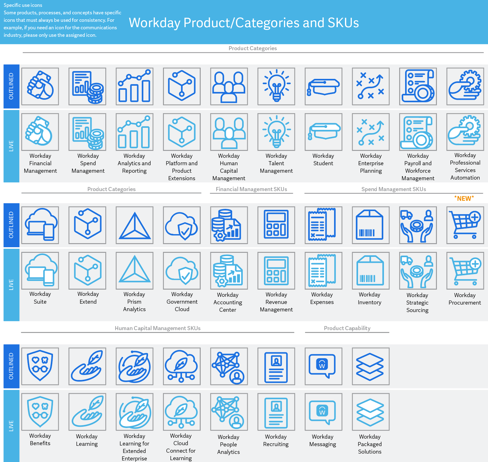
Authored the foundational design rules, grid systems, and structural guidelines for icon creation, ensuring every pixel aligned perfectly with the new brand’s geometric principles (such as the Workday sunrise arch).
Orchestrated a rigorous 6-week production sprint to deliver the massive asset library on time. Facilitated structured, regular design critiques and check-ins to enforce absolute visual consistency across multiple designers.
Developed the taxonomy and cataloging system for the final 600+ assets, successfully deploying a centralized, easy-to-use icon library for immediate adoption across the entire global organization.
Workday Icon Library 2018
Prior to the recent brand evolution, Workday’s iconography system was disorganized. With multiple designers creating assets in silos, the brand suffered from inconsistent styles and decentralized file management, exposing a critical need for unified visual governance.
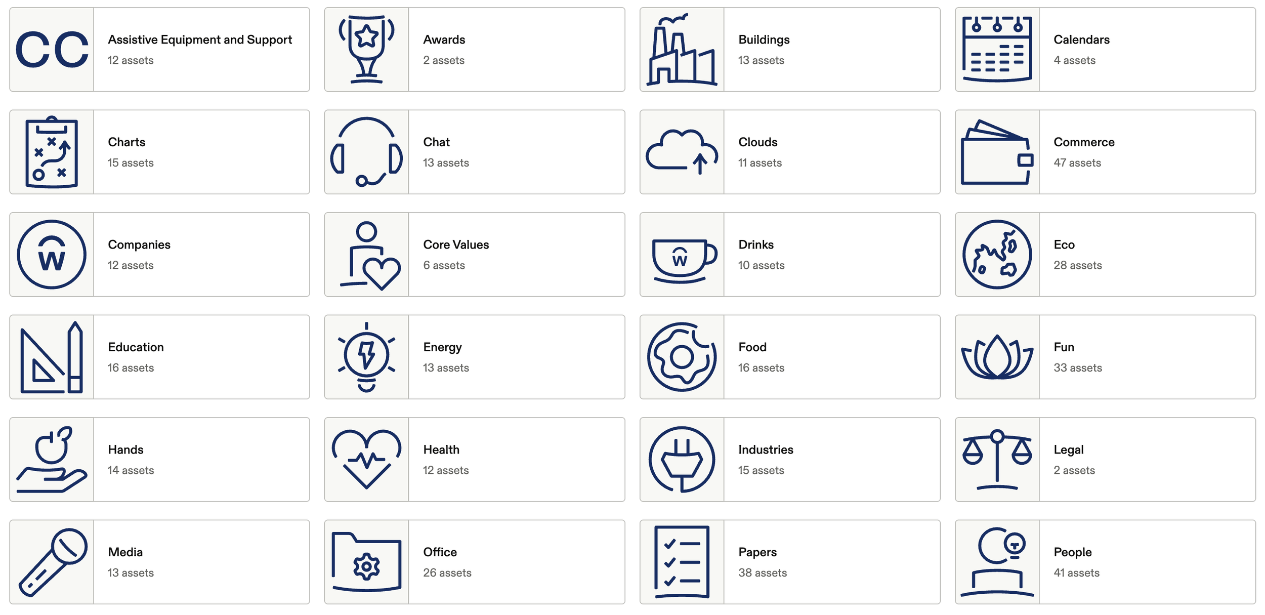
I Spearheaded a comprehensive audit of all existing assets, collecting, standardizing, and unifying over 800+ scattered icons from individual designers' desktops into one cohesive, high-fidelity library.
Created a logical categorization system for the massive library. Established strict usage rules and visual guardrails, ensuring specific icons were intentionally assigned to represent exact products, concepts, and enterprise ideas.
Instituted a rigorous operational cadence for the intake, review, and integration of new icons. This ensured all future artwork was properly shared, managed, and aligned with absolute design consistency across the organization.