

Workday Brand Refresh
Our Creative team sought out to evolve the Workday brand from a technology-centric identity to a human-centric one, visually articulating the people and work we support.
The rebrand’s visual identity anchors on the concept of the Workday sunrise, a metaphor for optimism and the daily cycle of work. This foundational element informs every aspect of the new visual language:
Photography: A shift towards authentic, human-first imagery that captures the genuine moments of connection and productivity in the modern workplace.
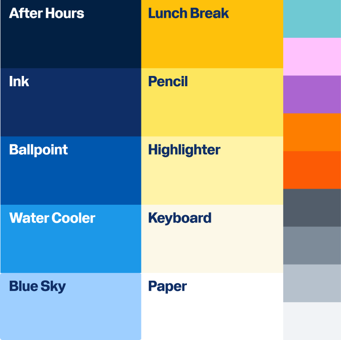
Color & Gradients: A gradient system rooted in our signature sunrise orange, representing the encapsulation of the full work day—from the first light of productivity to the satisfaction of a job well done.
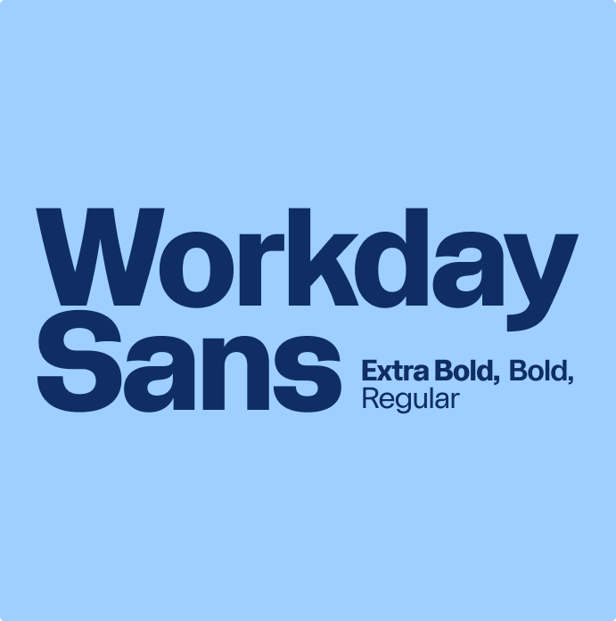
Typography (Workday Sans): A custom-engineered typeface where the terminals of each character subtly mirror the curve of the Workday sunrise arch, creating a subconscious visual link to the master brand in every headline.
Iconography: A comprehensive library of 600+ custom-drawn icons that integrate the "sunrise arch" geometry, ensuring that even the smallest functional elements reinforce our brand identity.
As Principal Art Director, I served as the guardian and architect of this system's rollout.
Oversaw the strategic deployment of brand elements across all internal and external touchpoints, ensuring a seamless transition for a global enterprise. Directed the bespoke customization of the Workday Sans typeface and logotype letterset, and personally directed and illustrated the expansive 600+ icon system to ensure perfect geometric alignment with the brand sunrise.
I created and presented comprehensive brand guidelines, empowering cross-functional teams and agencies to apply the new identity with confidence and consistency. Built a suite of accessible design tools and assets to create high-quality design across the organization.